This is the process I used to analyze the residual effects of redlining in Macon, Georgia. This is experimental, as ESRI maps are not well suited to web display. (Click on a map to enlarge.)
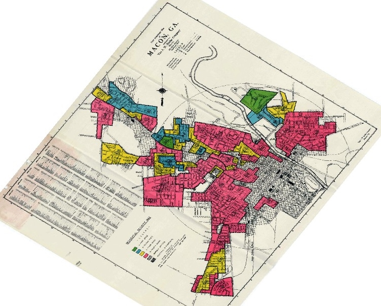
Here is the redlining map of Macon from the National Archives, georectified. Red areas were deemed unsuited for lending in the 1930s by the federal authorities, most often because they were home to large numbers of African Americans.
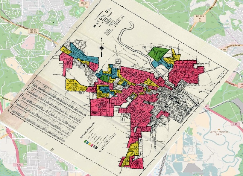
Here it is with the current background streets.
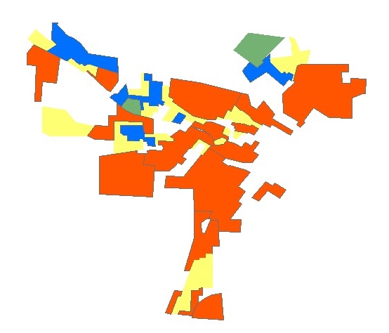
Here is the map replicated as hand-drawn polygons.
Here is the 2010 census block group map showing percentage of African-American residents for Macon.

Here I layer the redlining map and the 2010 map.
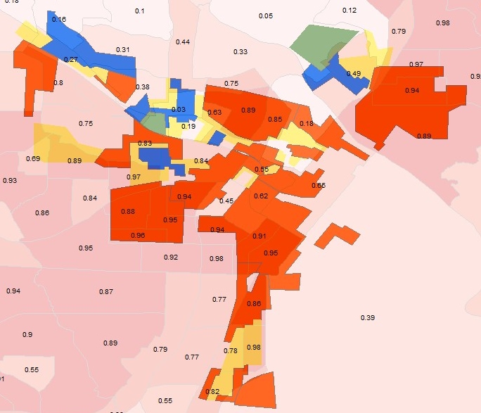 This is satisfactory for analyzing the data–one can visually compare the areas and see what changes have occurred since the 1930s, which is great. However, it shows the limitations of ESRI’s desktop maps. Next up, proper web mapping.