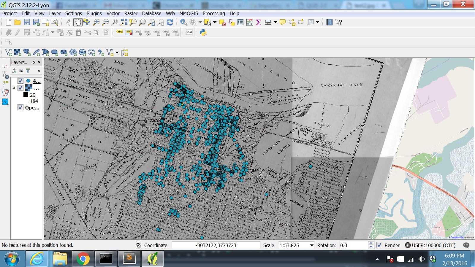
February 2016 update: I have now used Python and QGIS to plot addresses on a historic map!
This is more successful than my previous effort, in which I used the MMQGIS plugin to geolocate the addresses from Google. This time, I used the awesome Fred Gibbs’ Python script to pull the addresses from Google. This resulted in a higher number of successful matches (I do not yet know why). I am documenting my process below with screenshots. My purpose here is to determine the most useful techniques to achieve this goal.
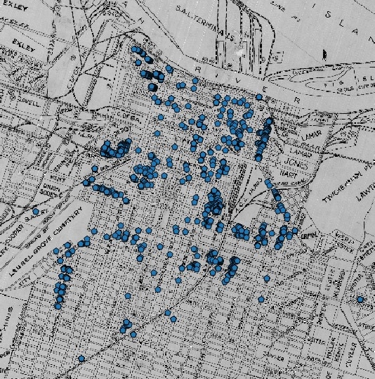
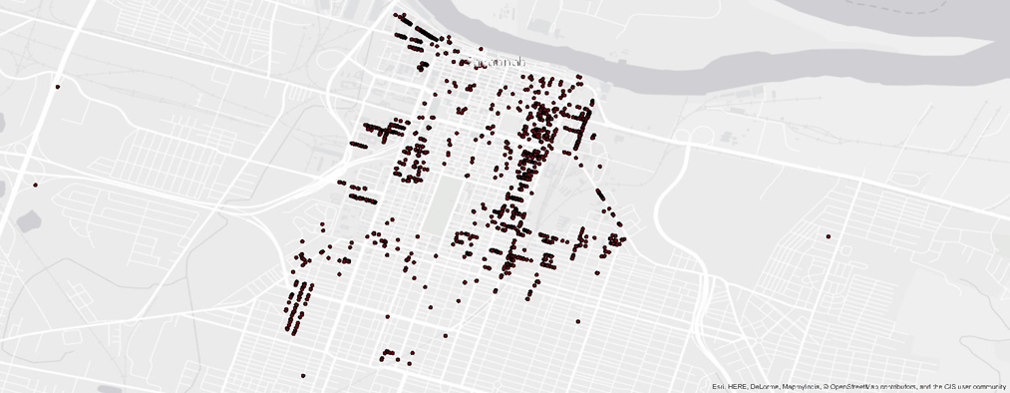
African-American Savannah residents as listed in 1900 City Directory, plotted on a 1910 map (now with more points!)–click on images to enlarge:
Python script:

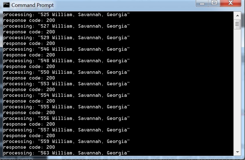
When you run this, it returns a new CSV file filled with geolocated addresses (Google will provide up to 2500 per day). If it looks like this, it’s working:
Earlier efforts are detailed below.
January 2016 update: I have now plotted addresses on a historic map!
Data is not available for racial demographics by tract prior to the 1940 census. Here, I used a 1900 Savannah City Directory (many are available for browsing in Ancestry) to generate a series of experimental maps.
First, I transcribed the 4,222 addresses which were listed as having African-American occupants (denoted in the street directory with a letter “c” after their name).
Then I uploaded the data to QGIS, using the MMQGIS plugin to georeference the addresses. This is very easy and a great free tool! It matched approximately 2000 of the addresses successfully. (I am also trying to use Python to match the addresses through Google, to compare the results.) With the addresses in QGIS, I could then layer it with a 1910 Savannah map courtesy of the Savannah Municipal Archives. This is wonderful for analyzing the data in its historical context.
 Here it is closer up (click any image to see larger).
 To create sophisticated webmaps, I think the approach explained in this NYPL Digital Labs tutorial is the way to go, although you have to place the points by hand. If you were to do that for thousands of points, this project would need to be very important to your work. But for data analysis, the technique I used here is fast and easy. Fred Gibbs’ tutorials explain the basics.
In 2015, I tried plotting the addresses with limited success, detailed below:
I entered that data into Excel, concatenated in “Savannah, Georgia,” and uploaded it to ArcMap. There, I used the geocoding feature to have it match the addresses for me. I had an 87% success rate. The others are not appearing, I believe, because several streets in Savannah were subsequently renamed (First, Second, Third, Fourth….). I will correct for this later, but wanted to share the map in process here. Click the image to see it in more detail.
Historians would expect the city to be less starkly racially segregated in 1900 than it would be later. And they would be correct.
ESRI charges by the “analytic” for geocoding, which is problematic for large-scale projects. Here, I recreated the map in Google Fusion Tables.